Exploratory Data Analysis on Corona Virus Dataset

What is Exploratory Data Analysis?
In statistics, exploratory data analysis (EDA) is an approach to analyzing data sets to summarize their main characteristics, often with visual methods. A statistical model can be used or not, but primarily EDA is for seeing what the data can tell us beyond the formal modeling or hypothesis testing task. Exploratory data analysis was promoted by John Tukey to encourage statisticians to explore the data, and possibly formulate hypotheses that could lead to new data collection and experiments.
Objective:-
This article is to explain the exploratory data analysis on the corona virus dataset.
Corona virus has infected more than 7000 people in South Korea.
KCDC (Korea Centers for Disease Control & Prevention) announces the information of COVID-19 quickly and transparently.
So in this article, we gonna explain:
- The corona virus impacts on people i.e. “What is the main reason for the corona virus spread? In which region there are more cases of corona virus affected patients? Current death, cured and isolated patient ratio?”
- Prediction of the number of total cases for future dates using linear regression.
1] Description:-
This dataset contains 7k+ patient information with 15 different features.
- id: Unique id of the patient.
- sex: Sex/Gender of the patient.
- birth_year: Birth year of the patient.
- country: Country of the patient.
- region: Residential region of the patient.
- Disease: 0-no disease / 1-underlying disease
- group: The collective infection.
- infection_reason: How the patient got infected.
- infection_order: The order of infection.
- infected_by: The ID of the patient who infected this patient.
- contact_number: The number of contacts with people.
- confirmed_date: The date of confirmation that people are infected.
- released_date: The date of discharge.
- deceased_date: The date of decease.
- state: The current state of the patient.
Here, the state is a class feature that states the current state of the patient which can be either isolated, released and deceased.
2] Importing the required packages and CSV file:-
In [1]:
import pandas as pd
import numpy as np
import seaborn as sns
import matplotlib.pyplot as plt
import warnings
warnings.filterwarnings('ignore')#Source of data: KCDC (Korea Centers for Disease Control & Prevention)
#https://www.kaggle.com/kimjihoo/coronavirusdataset
patient = pd.read_csv('patient.csv')
patient.head(5)
Out[1]:

In [2]:
patient.info()Out[2]:

In [3]:
patient['state'].value_counts()Out[3]:

Out of 7k+ patients, there are 50+ patients who got a discharge and 30+ patients couldn’t survive from this disease whereas remaining patients are still under isolation.
3] Data pre-processing:-
Adding new feature age by subtracting current year with birth year feature.
In [4]:
patient['age'] = 2020 - patient['birth_year']Now, let's create new data frames for each state i.e. isolated, released and deceased.
In [5]:
deceased = patient.loc[patient['state'] == 'deceased']
released = patient.loc[patient['state'] == 'released']
isolated = patient.loc[patient['state'] == 'isolated']
In [6]:
#Adding one more feature to deceased dataset which will contain the number of days patient survived.
date_column = ["confirmed_date","deceased_date"]
for i in date_column:
    deceased[i] = pd.to_datetime(deceased[i])
deceased["no_of_days_survived"] = deceased["deceased_date"] - deceased["confirmed_date"]
deceased.head(5)
Out[6]:

In [7]:
#Adding one more feature to deceased dataset which will contain the number of days patient was admitted before discharged.
date_column = ["confirmed_date","released_date"]
for i in date_column:
    released[i] = pd.to_datetime(released[i])
released["no_of_days_treated"] = released["released_date"] - released["confirmed_date"]
released.head(5)
Out[7]:

In [8]:
print('The percentage of released patient is: ',(len(released) * 100) / len(patient))
print('The percentage of deceased patient is: ',(len(deceased) * 100) / len(patient))
print('The percentage of isolated patient is: ',(len(isolated) * 100) / len(patient))
Out[8]:

In [9]:
state = 'Isolated', 'Released', 'Deceased'
sizes = [(len(isolated) * 100) / len(patient),(len(released) * 100) / len(patient),(len(deceased) * 100) / len(patient)]
explode = (0,1,2)
fig, ax = plt.subplots()
ax.pie(sizes, explode=explode, labels=state, autopct='%.1f%%',
        shadow=False, startangle=30)
ax.axis('equal')
plt.legend()
plt.title('Pie Chart')
plt.show()
Out[9]:

The above pie chart shows that around 98.9% of the total patient is under isolation whereas around 0.7% of the patient got discharged and unfortunately 0.4% of the patient couldn’t survive.
4] Probability distribution function:-
In [10]:
sns.FacetGrid(patient, hue="state", size=5) \
 .map(sns.distplot, "age") \
 .add_legend()
plt.title('PDF with age')
plt.grid()
plt.show()
Out[10]:

Observation:-
- Most of the patients who didn’t survive has age between 60 and 80.
- Most of the patients who got discharged has an age between 45 and 55.
5] Cumulative density function:-
In [11]:
counts, bin_edges = np.histogram(deceased['age'], bins=10, density = True)
pdf = counts/(sum(counts))
cdf = np.cumsum(pdf)
plt.plot(bin_edges[1:], pdf)
plt.plot(bin_edges[1:], cdf, label = 'Death')counts, bin_edges = np.histogram(released['age'], bins=10, density = True)
pdf = counts/(sum(counts))
cdf = np.cumsum(pdf)
plt.plot(bin_edges[1:], pdf)
plt.plot(bin_edges[1:], cdf, label = 'Recovered')plt.xlabel('Age of patient')
plt.ylabel('Percentage')
plt.legend()
plt.grid()
plt.show()
Out[11]:

The above graph shows the PDF and CDF for the deceased and released patients with age in X-axis.
Observation:-
- We can observer that almost 62% of the patient who recovered has age less than 50 years.
- All the patient who didn’t survive has an age greater than 40 and almost 80% of the deceased patient has an age greater than 55.
6] Count Plot:-
In [12]:
#Countplot the ith state feature.
patient.state.value_counts().plot.bar().grid()
Out[12]:

In [13]:
sns.countplot(x="sex", hue="state", data=patient).grid()Out[13]:

The above count plot shows the state of the patient of males and females.
Observation:-
- Most of the patients who didn’t survive are male patients.
7] Box Plot:-
In [14]:
sns.boxplot(x = 'state',y = 'age', data = patient)
plt.title('Box plot of age')
plt.grid()
plt.show()
Out[14]:

Observation:-
- Almost 50% of patient who got discharge has aged less than 42.
- More than 75% of patient who didn’t survive has an age greater than 60.
8] Violin Plot:-
In [15]:
sns.violinplot(x = 'state', y= 'age', data = patient, size = 4)
plt.title('Violin plot of age')
plt.grid()
plt.show()
Out[15]:

Observation:-
- Most of the patient who didn’t survive has an age of 60.
- Most of the patient who got discharge has an age of 40.
9] Bar Plot:-
In [16]:
patient.region.value_counts().plot.bar().grid()Out[16]:

Observation:-
- Most of the people who were infected by the corona virus belong to the capital area region.
In [17]:
plt.figure(figsize=(15,5))
patient.infected_by.value_counts().plot.bar().grid()
Out[17]:

Observation:-
- Most of the patients got infected by the patient with ID 31.
In [18]:
plt.figure(figsize=(15,5))
patient.confirmed_date.value_counts().plot.bar().grid()
Out[18]:
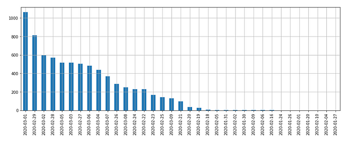
Observation:-
- On 1st March, most of the patients got confirmation that they are corona +ve.
In [19]:
plt.figure(figsize=(10,5))
patient.released_date.value_counts().plot.bar().grid()
Out[19]:

Observation:-
- On 4th March, most of the patient has been discharged.
In [20]:
plt.figure(figsize=(10,5))
patient.deceased_date.value_counts().plot.bar().grid()
Out[20]:

Observation:-
- On 5th March, unfortunately, most of the patients died.
10] 2D-scatter Plot:-
In [21]:
sns.set_style("whitegrid")
sns.FacetGrid(patient, hue = 'state', size = 7)\
.map(plt.scatter, 'age', 'region')\
.add_legend()
plt.title('Scatter plot : region vs age')
plt.show()
Out[21]:

Observation:-
- Most of the patient belongs to the capital area region.
- From Daegu and Gyeongsangbuk-do region most of the patients died.
11] 3D-scatter Plot:-
In [22]:
import plotly
import plotly.graph_objs as go
plotly.offline.init_notebook_mode()
trace = go.Scatter3d(
    x= patient['age'],
    y=patient['country'],
    z=patient['infection_reason'],
    mode='markers',
    marker={
        'size': 10,
        'opacity': 0.8,
    }
)
layout = go.Layout(
    margin={'l': 0, 'r': 0, 'b': 0, 't': 8}
)
data = [trace]
plot_figure = go.Figure(data=data, layout=layout)
plotly.offline.iplot(plot_figure)
Out[22]:

Observation:-
- In Korea country, most of the people got infected by the corona virus due to two reasons(i.e. contact with patient and visit to Daegu) irrespective of their ages.
- So we can conclude that contact with the infected patients is the main reason for corona spread.
12] Linear Regression:-
Explanation & problem statement:
- The number of cases from one day to the next day is completely random as the number of cases increases day by day and is independent of each other.
- As of now let’s assume the number of new cases each day is proportional to the number of existing cases, it means each day it’s get multiplied by a constant.
- Intuitively it means as the date changes, the number of confirmed cases also increases as they both are directly proportional to each other.
- So, if we compare total cases from one day to the next day, then tracking the changes between the number of cases is nothing but the growth factor.
- Simply growth factor is the ratio between two successive changes and that resultant ratio is the constant that gets multiplied each day.
- So, with existing accumulated data(number of cases each day), we’ll predict the expected number of cases for future dates by using Linear Regression which is one of the simplest but powerful concepts of machine learning.
Input and Output:
- In this model, we’ll take all unique confirmed dates and the total number of cases for that date as an input.
- So, I’ll use only confirmed_date and patient_id feature in my linear regression model.
- For all confirmed dates, we’ll compute the total count of the case for that date using patient_id feature as patient id is unique for every patient.
- For every confirmed date, it’s count value will be the sum of total case for that day plus the sum of total case for all preceding date(i.e. accumulated count).
- And the output that we’ll compute is the prediction of the total number of cases for future dates.
Step 1:
Computing the total number of cases for each confirmed date.
In [23]:
#Calculating total number of confirmed cases for each day
case_count_per_day = patient.groupby('confirmed_date').patient_id.count()
case_count_per_day = pd.DataFrame(case_count_per_day)
Step 2:
Computing the cumulative sum of the case for each date.
In [24]:
#Calculating cumulative sum of confirmed cases as date increased(total number of cases increases as date changes)
data = case_count_per_day.cumsum()
#Picking up the continuous data w.r.t. dates
dataset = data.iloc[16:]
Step 3:
Selecting the range of dates and the total number of future dates that want to be predicted.
In [25]:
# This var will be used to predict the cases till next 7 days
days_in_future = 7
dates = pd.date_range('2020-2-20','2020-3-11')#This is to predict the cases for future dates
future_y_pred = np.array([i for i in range(len(dates)+days_in_future)]).reshape(-1, 1)#This var will be used to compute the R^2
y_pred = np.array([i for i in range(len(dates))]).reshape(-1, 1)
Step 4:
Re-shaping the data to fit it in our model.
In [26]:
#Re-shaping the data
x = np.array([i for i in range(len(dates))]).reshape(-1, 1)
y = np.array(dataset).reshape(-1, 1)
Step 5:
Fitting the model and predicting the output.
In [27]:
from sklearn.linear_model import LinearRegressionlinear_model = LinearRegression()
linear_model.fit(x, y)
linear_pred = linear_model.predict(future_y_pred)
Step 6:
Calculating coefficient of determination(R²).
In [28]:
y_pred = linear_model.predict(y_pred)
r_sq = linear_model.score(x,y)
print("The coefficient of determination(R^2) for this model is: "+"{:.2f}".format(r_sq*100),'%\n')
Out [28]:

- The coefficient of determination of 96.91% shows that more than 96% of the data fit our linear regression model.
- Generally, a higher coefficient indicates a better fit for the model.
Step 7:
Plotting the graph with confirmed date in X-axes and linear model predicted and the actual number of cases in Y-axes.
In [29]:
#Size of graph
plt.figure(figsize=(15,6))#Plotting linear model predicted number case for each date(curent + future dates)
plt.plot(linear_pred, color='red', label='Predicted count')#Plotting actual number of cases for each date
plt.plot(dataset, label='Actual count')#Labeling X and Y axes.
plt.xlabel('Dates')
plt.ylabel('Total number of cases')#Drawing a vertical line which touches linear model predicted last value
plt.vlines(x=len(linear_pred)-1, ymin=0, ymax=12000, linestyles='dotted')
plt.text(x=len(linear_pred)+2, y=5000, s='predicted no. of\ncases by next week',color='black',\
         fontsize =15,horizontalalignment='center')
plt.xticks(rotation=90)plt.legend()
plt.show()
Out[29]:

- By observing the rate of change of the total number of cases as of date changes, we’ve predicted the expected total number of cases for next week(i.e. 7th day).
- The predicted total number of cases for next week(i.e. on 18th March) is approximately 11900.
13] Conclusion:-
- The given dataset is collected by KCDC for Korea, China, and Mongolia country.
- Only 0.4% of the patients died but also only 0.7% of patients recovered and still, around 98.9% of the patients are under isolation.
- So, the death probability is low but also recovering from this virus is difficult.
- Most of the patients died within 5 days after confirmation. So, the treatment of the corona virus has to be started immediately after confirmation as it impacts are really hazardous.
- The patient with age between 35 and 45 years is more likely to get released but this is not true in all cases.
- Most of the patients with age greater than 55 couldn’t survive from this virus.
- In Daegu and Gyeongsangbuk-do region, most of the patients died.
- One of the main reasons for the corona virus spread is due to contact with an infected patient.
- As this dataset is imbalanced, so predicting the survival chances is difficult. But we can observe the most likely reason for virus spread, the maximum number of infected patients in a particular region.
- So, even though the death percentage is low but recovering from this virus is difficult.
The complete code for this article can be downloaded from the below repository:
